Does Color Matter in Communications?
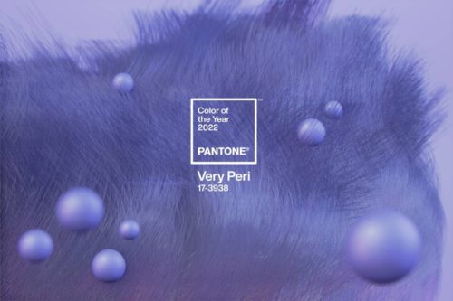
Last week, Pantone named its 2022 color of the year. They call it “Very Peri,” but it seems like straight-up periwinkle to me. (You know, basically the light purple spots on Sulley from Monsters, Inc.)
Silly names aside, the announcement earned the brand worldwide press. And it got me to thinking about how color matters in communications.
In our media trainings, for example, we advise clients to stay away from checks, plaids, herringbones and anything in the white family when doing a television interview. Color mash-ups are distracting to the eye, while white can alter your tone and appearance, another distraction. We recommend clean lines with one bright color, which generally looks great, as well as blues or grays with one accent color – like a tie or necklace – will work.
We’ve also found that black and blue – who many call colors of authority – dominate professional services’ logos. Green? Given it signals the environment to us psychologically, you would be hard-pressed to find a sustainable company that doesn’t use it in some way. Pink? While brands are moving away from it as the traditional color for female products, it is still the clear-cut choice of bakeries across the globe.
Questions about how to ‘choose the right colors’ for your communications strategy? HMA is always happy to help. Connect with us here.