Fun Fact Friday: Fonts Matter

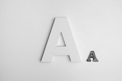
Photo Courtesy of Alexander Andrews on Unsplash
As Abbie and I were driving to a client meeting one day, there was one thing we really wanted to focus on…
“What are we going to have for lunch after this?!”
We were in a new area and unfamiliar with what was around us. Then, almost simultaneously, we spotted the same restaurant that had caught both of our attention.
After our meeting, we drove right to the hidden gem and probably had one of the best Mexican dishes of our lives. While we gracefully devoured our enchiladas, I looked up at the sign out front. A very small sign but a very attractive one.
“It’s the font,” I said. “I am a fan of fonts.”
We laughed at that comment, but it was true. It was the reason I wanted to go there. The font attracted me and I trusted it.
Without realizing it, fonts play a major role in how we interpret information. They can make us feel things. Fonts have different personalities that can create trust, elegance and comfort. They can also make us feel angry and confused. They can be the reason we scroll through a 10-page article or the reason we click-off after the first sentence.
In fact, visual elements are just as important as the words themselves. The typeface must be purposeful and appropriate. It must directly align with your message in order to avoid having your audience derail completely.
Whether it’s serious, casual, playful, graceful or authoritative, it’s imperative to understand what the font is saying and how that aligns with your intentions.
After all, you can say a lot without saying anything.

